Guide to Digital Accessibility
In this guide, I break down the core POUR principles -Perceivable, Operable, Understandable, and Robust - and share a strategic roadmap for integrating universal design.
In my 20 years of building for the web, the most profound shift I’ve witnessed isn't a new framework—it’s the shift toward Universal Design. Accessibility is often treated as a final "checklist" before launch, but as a Architect, I view it as the very foundation of a project’s structural integrity.
If a building’s blueprint doesn't include a ramp, it’s not finished. The same logic applies to your codebase.
The Four Pillars of Accessibility (POUR)
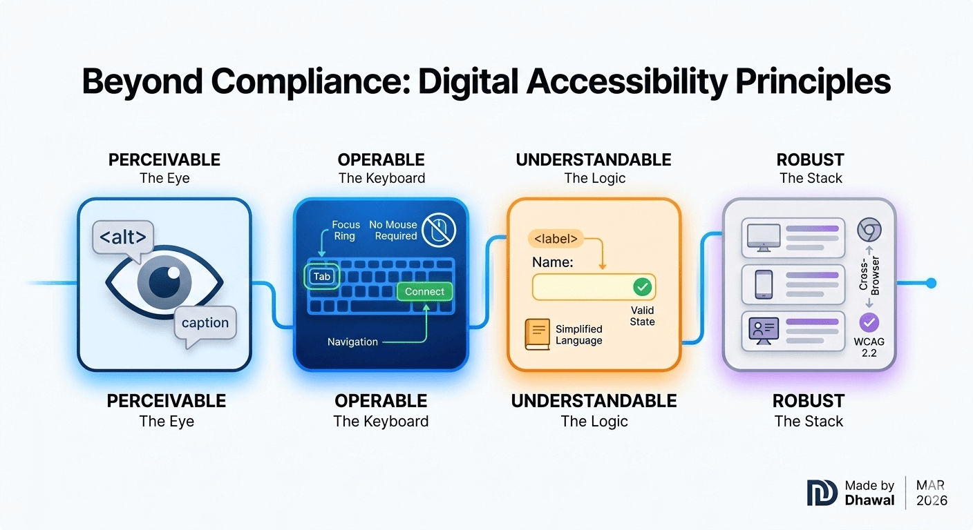
Think of these four principles as the structural columns of your application. The Web Accessibility Initiative (WAI) created the POUR framework to simplify WCAG 2.1/2.2 compliance.Perceivable (See/Hear)
Information must be presented in a way that users can take it in using their senses.- Analog: If a blind user visits your site, they can’t perceive your imagery unless you provide alternative text.
- Tip: Always include
alt="..."on<img>tags. Describe the image’s purpose, not just its content. For decorative images, use an emptyalt="".
Operable (Interact)
The interface cannot require interactions that a user cannot perform.- Analog: If your site only works with a mouse, it is not operable for a user who relies on a keyboard or a switch control.
- Tip: If you are building a custom interactive element (like a modal or dropdown), ask yourself: "Can I use every feature on this screen using only my
TabandEnterkeys?"
Understandable (Read/Navigate)
Users must be able to comprehend both the information on the screen and how to operate the interface.- Analog: An interface full of inconsistent labels or confusing, tech-heavy jargon is a massive barrier for users with cognitive or learning disabilities.
- Tip: Use simple language. Don't build form inputs (like fields) without using explicit
<label for="...">tags. Labels are not just visual; they are crucial for screen readers.
Robust (Maintain/Adapt)
The code must work on a wide variety of browsers, devices, and assistive technologies (like screen readers).- Analog: Your site must keep working as browsers update and as users choose different tools to navigate the web.
- Tip: Stick to modern web standards. If you are coding to a framework (like React or Angular), make sure you are not "div-souping"—using generic
<div>tags for everything. Use semantic HTML (which we’ll cover next).
Best Practices: The Junior’s Checklist
Here are the critical "bread and butter" habits you must start building today.Semantic HTML is Your Most Powerful Tool
The #1 accessibility mistake junior developers make is overusing<div> and <span>. These elements convey NO meaning.
Use semantic elements correctly:
- Don't use a
<div>for a clickable action. Use a<button>. (Buttons get keyboard focus and 'Enter' key support automatically). - Don't use a
<div>for navigation. Use<nav>. (Screen readers allow users to "jump" straight to navigation landmarks). - Don't use a
<div>for your main content. Use<main>.
Logical Heading Order (H1–H6)
Headings (<h1> to <h6>) create the structural blueprint of your page. They are not styling tools.
- Rules: You should only have one
<h1>per page (usually the title). Never skip a heading level (don't jump from<h1>to<h3>).
Color and Contrast (It's not about being boring)
Your text contrast must meet WCAG AA standards: A contrast ratio of at least 4.5:1 for standard text.- Tip: Download a simple browser extension like Lighthouse (built-in to Chrome DevTools) or WAVE. It will flag poor color combinations instantly.
Never Remove Focus Rings
The subtle outline that appears when youTab through links is called a focus ring. NEVER use CSS to do this: outline: none;. This is the user interface equivalent of turning off all the lights in a room. Keyboard users need to see exactly where they are on the page.
Recommendations: Accessibility-First Mindset
When starting a new project, don't wait for the final audit to fix things. Follow this architecture-first roadmap:Step 1: Unplug Your Mouse
Spend 10 minutes trying to navigate your wireframes or competitor sites using only your keyboard. If the experience is impossible, that is the problem you need to architect around.Step 2: Automate Early
Integrate accessibility audits into your development workflow. In Chrome DevTools, the Lighthouse audit has an accessibility score. Aim for 100 on every component you build. This is how you catch the low-hanging fruit (missing labels, bad contrast) before they pile up.Step 3: Build Accessible Components
If you are responsible for building a reusable component (like a component library dropdown, tab panel, or modal), you are the gatekeeper.- Tip: Search for "WAI-ARIA Authoring Practices Guide" for the specific pattern you are building. It will tell you exactly which ARIA attributes and keyboard interactions you are responsible for implementing.