

How Responsive Breakpoints Actually Work (With a Live Demo)
Ever wondered how a website switches from one column on mobile to four on desktop? A hands-on look at CSS Grid, media queries, and breakpoints — with an interactive demo where you can watch the layout change in real time.
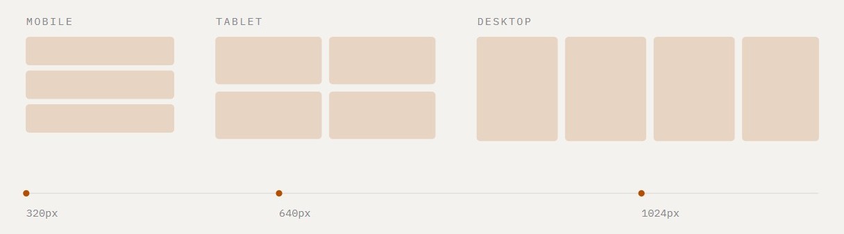
Ever wondered how a website "knows" to show one column on your phone and four on your desktop? The HTML doesn't change. The magic is in three or four lines of CSS called media queries — and the exact pixel widths where they kick in are called breakpoints.
I built a small interactive demo to make this click, and in this post I'll walk through the idea behind it.
↔ Drag the window edge. That's the whole pitch.
The one-sentence version
A breakpoint is a screen width at which your CSS swaps one layout rule for another. Below 640px? One column. 640px or wider? Two. And so on.The setup: CSS Grid does the heavy lifting
Start with a simple card grid. Mobile-first means the base rule is the smallest layout — one column:/* the number comes from the card, not the device */ .card { display: grid; grid-template-columns: repeat(1, 1fr); gap: 12px; }
Adding breakpoints
Now we layer wider layouts on top using//* Tablet — 2 columns */ @media (min-width: 640px) { .cards { grid-template-columns: repeat(2, 1fr); gap: 14px; } } //* Laptop — 3 columns */ @media (min-width: 900px) { .cards { grid-template-columns: repeat(3, 1fr); gap: 16px; } } //* Desktop — 4 columns */ @media (min-width: 1180px) { .cards { grid-template-columns: repeat(4, 1fr); gap: 18px; } }
The part that confuses everyone
Here's the thing: at 1200px wide, all four rules match. 1200 is greater than 640, greater than 900, and greater than 1180. So which one wins? The last one in the stylesheet. CSS reads top to bottom, and later rules override earlier ones. That's exactly why mobile-first CSS lists breakpoints from smallest to largest — each wider screen inherits the base layout, then upgrades it if there's room. Write them in the wrong order and your desktop layout gets silently overwritten by your tablet one. (Ask me how I know.)Why 1fr makes this painless
Each grid track is 1fr — one equal share of the available space. That means:
- No percentage math (
width: 33.333%and its rounding bugs are gone) - No clearing floats
- Cards resize fluidly between breakpoints, not just at them
- The gap is real space, not margin hacks
repeat(2, 1fr) to repeat(3, 1fr) — and the whole layout reflows.
A gotcha I hit while building the demo
The demo simulates a resizable viewport using container queries (@container), which behave just like @media — with one sneaky difference: container queries measure the element's content box. My frame had 16px of padding, so a "1200px" frame was actually measured at 1165px — just under my 1180px breakpoint. The 4-column layout never fired, and it took me a while to see why.
Try it out
Open the interactive demoTakeaways
- Write mobile-first: base rule = smallest layout, then add
min-widthqueries from small to large. - Use CSS Grid with
1frtracks — changing layouts becomes a one-line edit. - Breakpoints can change more than columns: scale gap, padding, and type too.
- Remember the cascade: at large widths, multiple rules match and the last one wins.
Got questions or a breakpoint horror story of your own? I'd love to hear it.