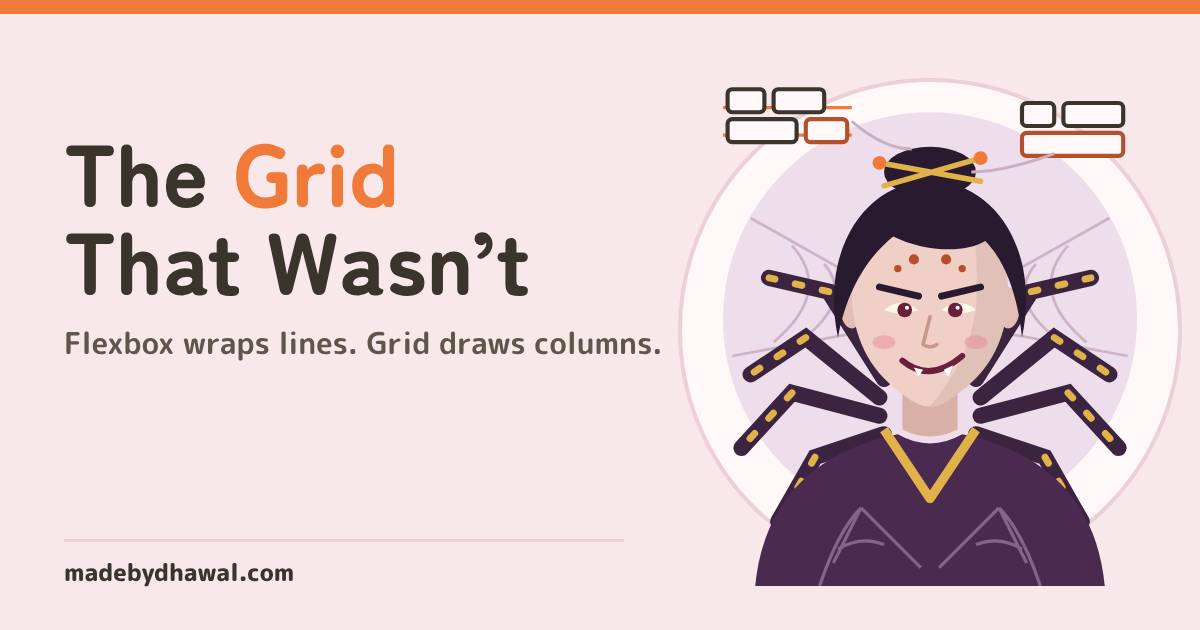
The Grid That Wasn’t: Flexbox vs Grid, and why your last row of cards stretches
Your flex-wrap gallery looks like a grid until the last row stretches and nothing lines up. Kitsu, Domlok's fox of CSS and layout, untangles the Crooked Weaver: Grid for rows and columns, Flexbox for single lines, and subgrid for the insides.

Told by Kitsu, with Kai asking the questions
Kitsu: You wove this gallery from single threads, Kai. Each row has no idea the row above it exists.

If your card gallery uses flex-wrap and the last row stretches wider than the rest, or the cards never line up into columns, you are asking Flexbox for a grid. Flexbox lays out one line at a time. Use CSS Grid for rows and columns together, and keep Flexbox for the single lines inside each card.
In the world of Domlok this is the work of the Crooked Weaver, a jorōgumo who spins every row from its own thread. Her galleries look like grids from a distance. Up close, nothing lines up, and the last row is always the wrong width.
Your guide for this episode is Kitsu, the Fire guide of Domlok, the fox spirit who keeps CSS and layout in order. A bug about rows, columns and who decides the width is her territory. Kai, as usual, is the one who built the gallery first and asked questions later.
The gallery that wasn’t a grid
Kai’s scroll gallery has five cards. He wants three per row on a wide screen, fewer on a narrow one, and no media queries. Flexbox with wrapping looks like the answer:
.gallery {display: flex; flex-wrap: wrap; gap: 18px;}
.card {flex: 1 1 300px; /* grow, shrink, start at 300px */}
KaiIt wraps into rows, so it’s a grid. Three on top, two underneath. Ship it?
In a container about 1,000 pixels wide, three cards fit on the first row. The other two wrap onto a second row, and then each of them grows to half the width. The second row’s cards are wider than the first row’s, and their edges don’t line up with anything above them.
KitsuIt wraps, Kai. That does not make it a grid. Every wrapped row is its own flex line, and the free space is shared only inside that line.
Why it happens: Flexbox thinks in lines
Flexbox was designed for layout in one dimension: a row or a column. When you turn on flex-wrap, the browser breaks the items into separate flex lines. Each line is laid out on its own, so flex-grow hands out the leftover space of that line to the items in that line, and nobody else.
- Line 1: three cards start at 300px, and the spare space is split three ways.
- Line 2: two cards start at 300px, and the much bigger spare space is split two ways, so each card ends up about half the row.
- Columns: there are none. Flexbox never created any, so there is nothing for line 2 to line up with.
MDN puts it simply: Flexbox works from the content out, and Grid works from the layout in. A good warning sign from the same page: if you are setting widths on flex items just so they line up with the row above, you probably want a grid.
KaiSo the cards in row two have no idea row one exists.
The fix: draw the tracks with Grid
Grid lets you define columns first, then drops each card into a cell. One line gives you a responsive gallery with no media queries:
.gallery { display: grid; grid-template-columns: repeat(auto-fill, minmax(300px, 1fr)); gap: 18px; }Read it as: make as many columns as fit, each at least 300px wide, and share any leftover space equally (1fr). Now the two cards on the last row sit in columns one and two, exactly as wide as every card above them. The .card needs no flex value at all.
auto-fill or auto-fit?
Both make as many columns as fit. The difference only shows when there are fewer items than columns. auto-fill keeps the empty columns, so two cards stay card-sized. auto-fit collapses the empty columns to zero, so two cards stretch across the whole row. For a gallery, auto-fill is usually what you want.
KitsuAsk one question before you choose: do I line things up in a row, or in a column, or in both at once? Both at once is a grid.
Flexbox or Grid: which one when
| You are laying out | Use | Why |
|---|---|---|
| A navbar, toolbar or row of tags | Flexbox | One line; items size to their content |
| A card’s title, text and button stacked | Flexbox (column) | One direction; margin-top: auto pushes the button down |
| A gallery of cards | Grid | Rows and columns that must line up |
| A page with header, sidebar, main and footer | Grid | Two-dimensional areas |
| A form with labels and fields in columns | Grid | Labels and fields align across rows |
| Insides of cards that must align across cards | Grid with subgrid |
The card borrows the gallery’s rows |
Nest them: grid outside, flex inside
KaiSo I should use Grid for everything now?
KitsuNo. They are partners. Grid places the cards. Inside each card, Flexbox lays out the single line of tags and the button.
A grid item can be a flex container, and a flex item can be a grid. Choose for each box on its own. Here the card is a flex column, and the button is pushed to the bottom of every card however long its text is:
.card {display: flex; flex-direction: column;}
.card .tags {display: flex; flex-wrap: wrap; gap: 8px;}
.card .buy {margin-top: auto; /* takes the spare space above it */}
And the markup stays plain:
<section class="gallery">
<article class="card">
<h3>Rain Scroll</h3>
<ul class="tags">
<li>css</li>
<li>layout</li>
</ul>
<p>Twelve verses on weather and patience.</p>
<a class="buy" href="/rain">Read</a>
</article>
<!-- more cards -->
</section>
Line up the insides with subgrid
One last thread: a long title pushes its description down, so the descriptions in a row of cards start at different heights. subgrid fixes that by letting each card use the gallery’s own row tracks.
.card { display: grid; grid-row: span 3; /* title, text, button */ grid-template-rows: subgrid; /* use the gallery's rows */ }Each card spans three of the gallery’s rows and places its title, text and button on them. The tallest title in a row sets that row’s height for every card, so all the descriptions start on the same line. The gap of the gallery is passed into the subgrid; set row-gap on the card if you want it tighter. Subgrid is Baseline widely available: it has worked in all major browsers since September 2023.

KaiGrid outside, flex inside, subgrid for the titles. The Weaver has nothing left to tangle!
See the threads in DevTools
- Open Chrome DevTools and go to the Elements panel. A grid container has a grid badge next to it; a flex container has a flex badge.
- Click the badge to draw the overlay on the page. A flex overlay outlines each flex line separately, which is how you spot a fake grid.
- Open the Layout pane. Under Grid, turn on line numbers and Show track sizes. Each column shows its authored and computed size, for example
1fr - 341px, and every column should match.
Before you merge a layout
- Do these items need to line up in rows and columns? Use Grid.
- Is it a single line of things sized by their content? Use Flexbox.
- Are you setting widths on flex items only so they match the row above? Switch to Grid.
- Does the last row of a responsive gallery keep the same card width? Check with fewer items too.
Acharya's Rule #18Rows and columns together, use Grid. One line, use Flexbox. Nest them freely.

Next episode: The Temporal Dead Zone. Why reading a let before its line throws a ReferenceError while var quietly gives you undefined, and what hoisting really does.
Think you can untangle the Weaver yourself? Play Kitsu’s Loom on domlok.in and earn seal 18.
Watch the video and the 36-second Short on YouTube at @dom-lok and save the carousel on Instagram at @mbd.domlok.
Further reading
- MDN: Relationship of grid layout to other layout methods
- MDN: repeat(), auto-fill and auto-fit
- MDN: Subgrid
- Chrome DevTools: Inspect CSS grid
 More from Vishwa in Frontend