
Part 1.2: Image LCP: fetchpriority, Preload & Format Decisions
The highest-ROI line in image performance is one attribute most codebases still don't use: fetchpriority="high". Here's the image LCP fix list, ordered by actual impact — priority, preload, responsive sizing, and formats — and why teams work it in exactly the wrong order.

Told by Vayu
48
If your LCP is an image and your dominant phase is load delay or load time, this is your fix list — in order of bang-for-buck, which is not the order most teams work in.
The goal isn't simply to make the image smaller.
The browser has to discover it, prioritize it, download it, and finally render it. If any one of those steps happens too late, your LCP suffers.
Think about image LCP as:
Discover → Prioritize → Size → Compress → Deliver → Render
Before changing anything, find out which part of that chain is actually slow.
Before you optimize: find where the time is going
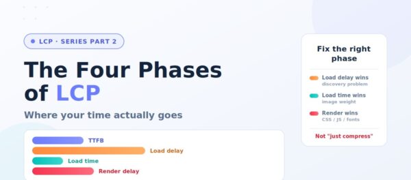
Don't start by converting your hero image to AVIF. First, identify the LCP element and look at the LCP breakdown in PageSpeed Insights or Chrome DevTools. The important phases are:- Time to First Byte (TTFB) — the HTML document itself is arriving late.
- Resource Load Delay — the browser discovered the LCP image too late.
- Resource Load Duration — the image was discovered, but took too long to download.
- Element Render Delay — the image has downloaded, but something is preventing it from being painted.
First: make it discoverable
The browser's preload scanner reads raw HTML ahead of normal parsing and can start important downloads early. Everything about fast image LCP starts with keeping your hero visible to it. That means a real<img> tag in server-sent HTML.
Not a CSS background, which may only become discoverable after the relevant CSS is downloaded and processed.
Not a JS-injected element, which doesn't exist until the script runs.
Not a client-rendered component that appears only after JavaScript executes and hydration completes.
For example:
<img src="/hero.avif" width="1200" height="600" alt="...">HTML vs CSS vs JavaScript: Discovery Matters
The same image can have very different performance characteristics depending on how it reaches the browser.| Implementation | When the browser can discover it | LCP recommendation |
|---|---|---|
<img> in server-rendered HTML |
Very early | 🟢 Preferred |
<img> in HTML parsed by the browser |
Early | 🟢 Good |
CSS background-image |
After CSS is discovered and processed | 🟡 Use when appropriate |
JavaScript-injected <img> |
After JavaScript executes | 🔴 Avoid for LCP |
| Client-rendered component | After JS/rendering/hydration | 🔴 Avoid for critical LCP |
The one attribute worth memorizing
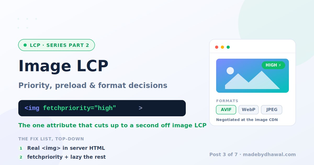
Browsers don't necessarily treat every image as equally important. An image's priority can change as the browser learns more about the page and its layout. So, when you know an image is the LCP candidate, give the browser an explicit priority hint:<img src="/hero.avif" fetchpriority="high" width="1200" height="600" alt="..." >fetchpriority="high" tells the browser that this image is more important than its default priority would suggest.
It isn't a magic command that guarantees the image wins every network race. But when an important LCP image is being deprioritized, it can help the browser start fetching it earlier.
One attribute can make a surprisingly large difference when the bottleneck is image discovery or prioritization.
The flip side is just as important: don't mark everything as high priority.
Your below-the-fold images don't need to compete with the hero. That's where loading="lazy" belongs:
<img src="/product-1.avif" loading="lazy" width="600" height="400" alt="..." >Preload: sharp tool, handle carefully
<link rel="preload" as="image"> can force the browser to discover an important image earlier.
For example:
<link rel="preload" as="image" href="/hero.avif" >"Trust me. This matters more than the resources you would otherwise choose."A head full of preloads is a priority system at war with itself. So the rule is simple: If a normal
<img> in server-rendered HTML can do the job, fix the markup instead of adding a preload.
Preload should solve a discovery problem, not compensate for poor markup.
Responsive sizing: stop shipping desktop pixels to mobile
Getting the image format right isn't enough if you're downloading far more pixels than the device needs.srcset and sizes let the browser choose an appropriate image candidate:
<img  src="/hero-1200.avif"
srcset=" /hero-480.avif 480w,  /hero-768.avif 768w,  /hero-1200.avif 1200w,  /hero-1600.avif 1600w "
sizes="100vw"  width="1200"  height="600"
fetchpriority="high" alt="..." >sizes information when choosing which candidate to download.
There are two traps worth an architect's attention.
Trap 1: sizes lies
This is surprisingly common:
sizes="100vw""I'll probably need the full viewport width."The browser may choose a much larger image than necessary. Your
sizes attribute should describe the image's actual rendered width, not what the component happens to be called.
If your hero is 1200px wide on desktop but 600px wide on a particular layout, tell the browser that.
Trap 2: device pixel ratio
A high-DPR phone doesn't automatically need a giant 3x image.
The browser may choose a higher-resolution candidate because the physical pixel density is higher, but beyond a point the additional pixels provide diminishing visual returns while increasing download cost.
For many real-world interfaces, capping image candidates around 2x is a pragmatic starting point. Validate against actual visual quality rather than blindly generating 3x or 4x assets.
The goal is not maximum resolution.
It's sufficient resolution for the rendered size.
Formats, honestly
AVIF usually provides better compression than WebP, and both can significantly reduce the transfer size compared with JPEG for photographic content. But don't turn this into a religious argument about formats. The real-world difference depends on:- image content
- quality settings
- dimensions
- encoding settings
- browser support
- CDN capabilities
- encoding cost
"Convert every image to AVIF manually."It's to make format selection infrastructure. Authors upload the original. Your image pipeline or CDN generates the required variants and serves an appropriate format based on browser support and request characteristics. Conceptually:
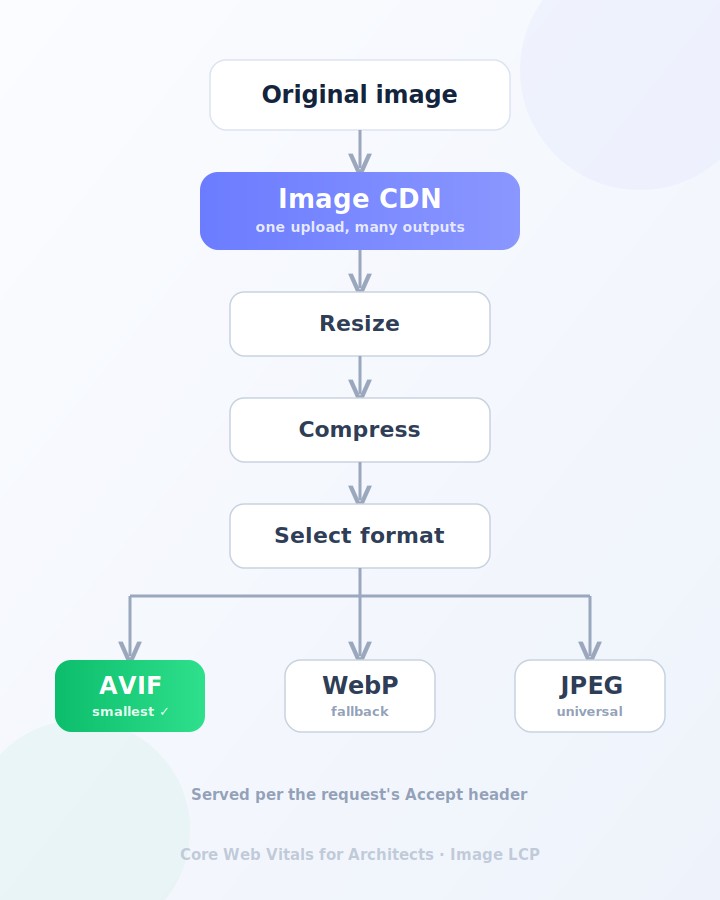 Format stops being a per-image decision that developers can fumble and becomes part of the delivery platform.
If you standardize one thing this quarter, standardize the image pipeline.
Format stops being a per-image decision that developers can fumble and becomes part of the delivery platform.
If you standardize one thing this quarter, standardize the image pipeline.
Don't forget the actual image dimensions
An image that is displayed at 1200 × 600 doesn't need to arrive as a 4000 × 2000 original. This sounds obvious. Yet oversized source images remain one of the easiest ways to waste bandwidth. Your image pipeline should ideally handle:- responsive widths
- format conversion
- compression
- quality settings
- DPR variants
- caching
- CDN delivery
Common hero image mistakes
These are the patterns I see repeatedly. ❌ Lazy loading the LCP image<img src="/hero.avif" loading="lazy">loading="lazy" just because it's an image.
❌ Preloading everything
<link rel="preload" as="image" href="/hero.avif">
<link rel="preload" as="image" href="/banner.avif">
<link rel="preload" as="image" href="/product.avif">hero.innerHTML = '<img src="hero.avif">';<img> is often the better architecture.
❌ Fixing the format when the problem is rendering
If your LCP breakdown says:
Resource Load Duration: 300ms
Element Render Delay: 1.5sWhere each optimization actually helps
| Optimization | What it fixes | Primary LCP phase | Priority |
|---|---|---|---|
Server-rendered <img> |
Late image discovery | Load Delay | 🔥 Critical |
fetchpriority="high" |
Low image priority | Load Delay / Load Time | 🔥 Critical |
Remove loading="lazy" |
Delayed request | Load Delay | 🔥 Critical |
Correct srcset / sizes |
Oversized downloads | Load Time | 🔥 High |
| AVIF / WebP | Large transfer size | Load Time | 🔥 High |
| Image CDN | Delivery latency and sizing | Load Time | 🔥 High |
| Compression | Transfer size | Load Time | 🔥 High |
| Preload | Late resource discovery | Load Delay | ⚠️ Conditional |
| Width / height | Layout stability | Rendering | ✅ Recommended |
| Reduce blocking CSS/JS | Rendering blockage | Render Delay | ⚠️ Depends |
New to this series?
New here? Start with the series intro. This post assumes the four phases of LCP.
← Previous: The Four Phases of LCP → Up next: Text LCP: Fonts, FOIT, FOUT & font-display — when your headline is the LCP and your font is the villain.